PSORIASIS:
An intergenerational perspective
PROJECT IN PRACTICE


Initial Creative Output
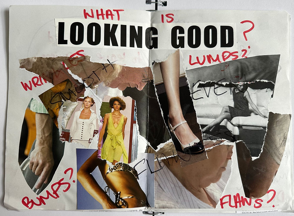
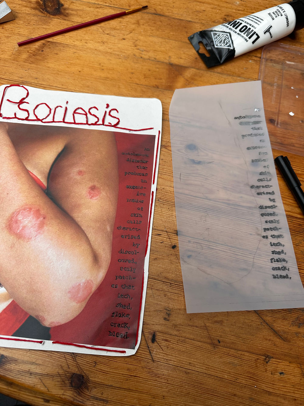
This zine was created as part of my indicative creative output and established many of the project’s key themes and mediums early on, particularly the use of red and black imagery alongside print-based formats such as zines. The zine format felt especially appropriate for exploring the relationship between skin and self, as it allowed me to combine both written and visual elements.
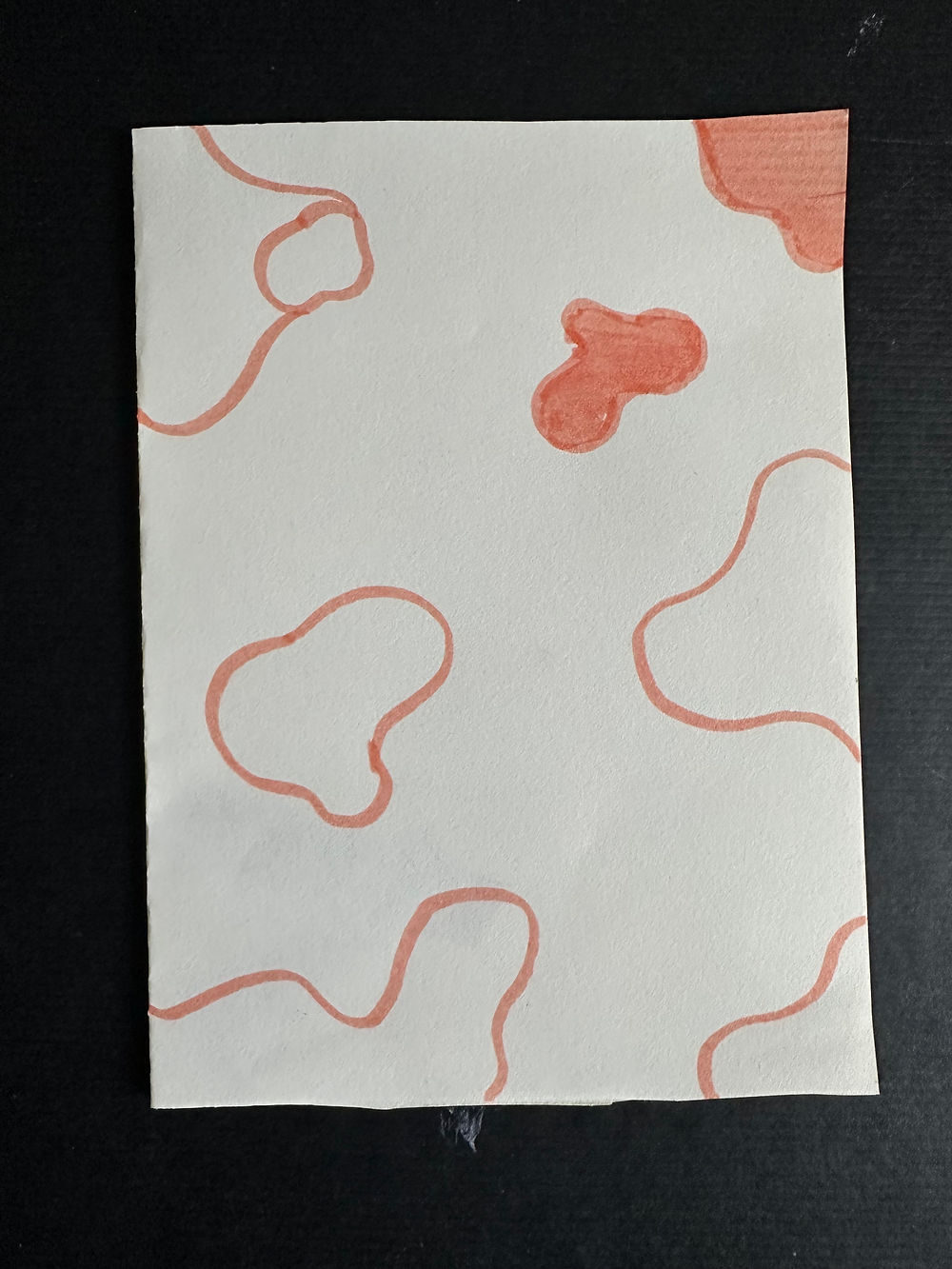
One of the main challenges was working with imagery that was initially unrelated to the subject of skin, specifically architecture magazines used as source material. What I learnt from this is to think more creatively and experiment with visual language, such as using pink blotches to represent psoriasis. Identifying these approaches early in the project proved really valuable, as it gave me time to further explore materials, methods of layering, and different ways of writing copy.


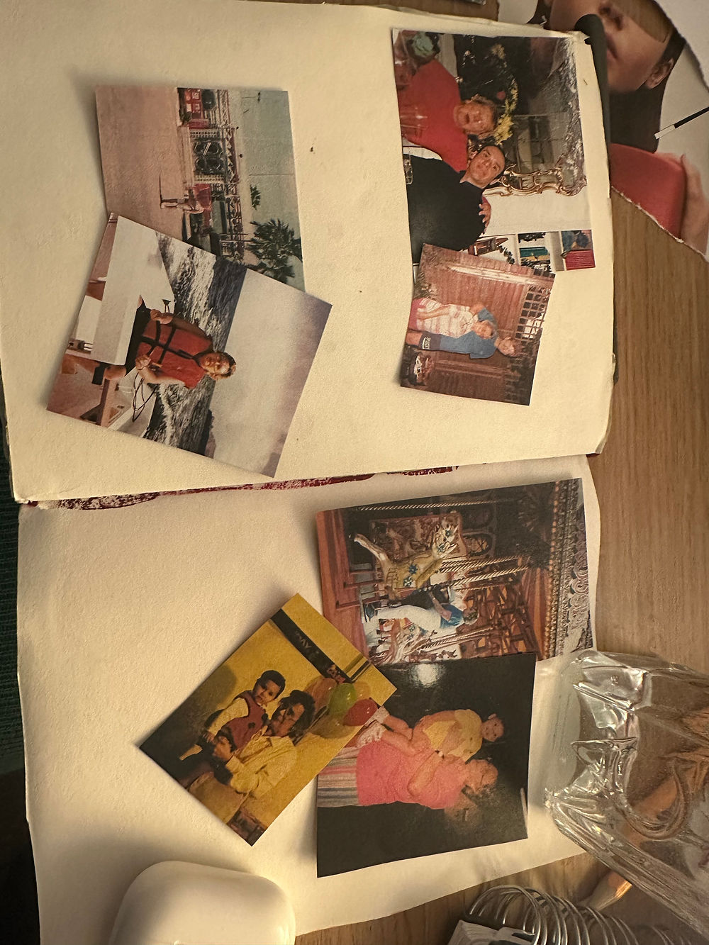
Collecting Photos of My Grandmother
I collected photographs of my grandmother by scanning and digitally uploading them into a document so that multiple copies could be printed and analysed. While this formed part of my photographic research and visual analysis, the images were primarily gathered to identify behavioural patterns in how she presented both herself and her skin, as well as to observe the severity of her flare-ups over time. These photographs were later incorporated into the zine alongside written reflections and observations to contextualise and deepen the narrative surrounding her experiences.
This method proved particularly valuable when developing my creative outputs, as the photographs became important visual references within works such as my artist book and zines. Including these archival images added greater depth, authenticity, and emotional substance to the surrounding content, strengthening the connection between the visual material and the personal reflections presented alongside it.
One challenge I encountered during this process was controlling the sizing of the photographs when scanning, printing, cutting, and sticking them into layouts. Achieving accurate proportions often relied on trial and error during printing, which became time-consuming and inconsistent. To overcome this when producing the artist book, I adapted my process by editing the photographs in Photoshop before formatting and resizing them digitally using Adobe Acrobat. Rather than printing images separately and manually cutting and sticking them into place, I printed the photographs directly onto the paper being used for the final layouts. This allowed for much more accurate measurement, consistency, and control over composition, while also creating a cleaner and more professional finish within the final outcome.


Photographing My Skin to Document
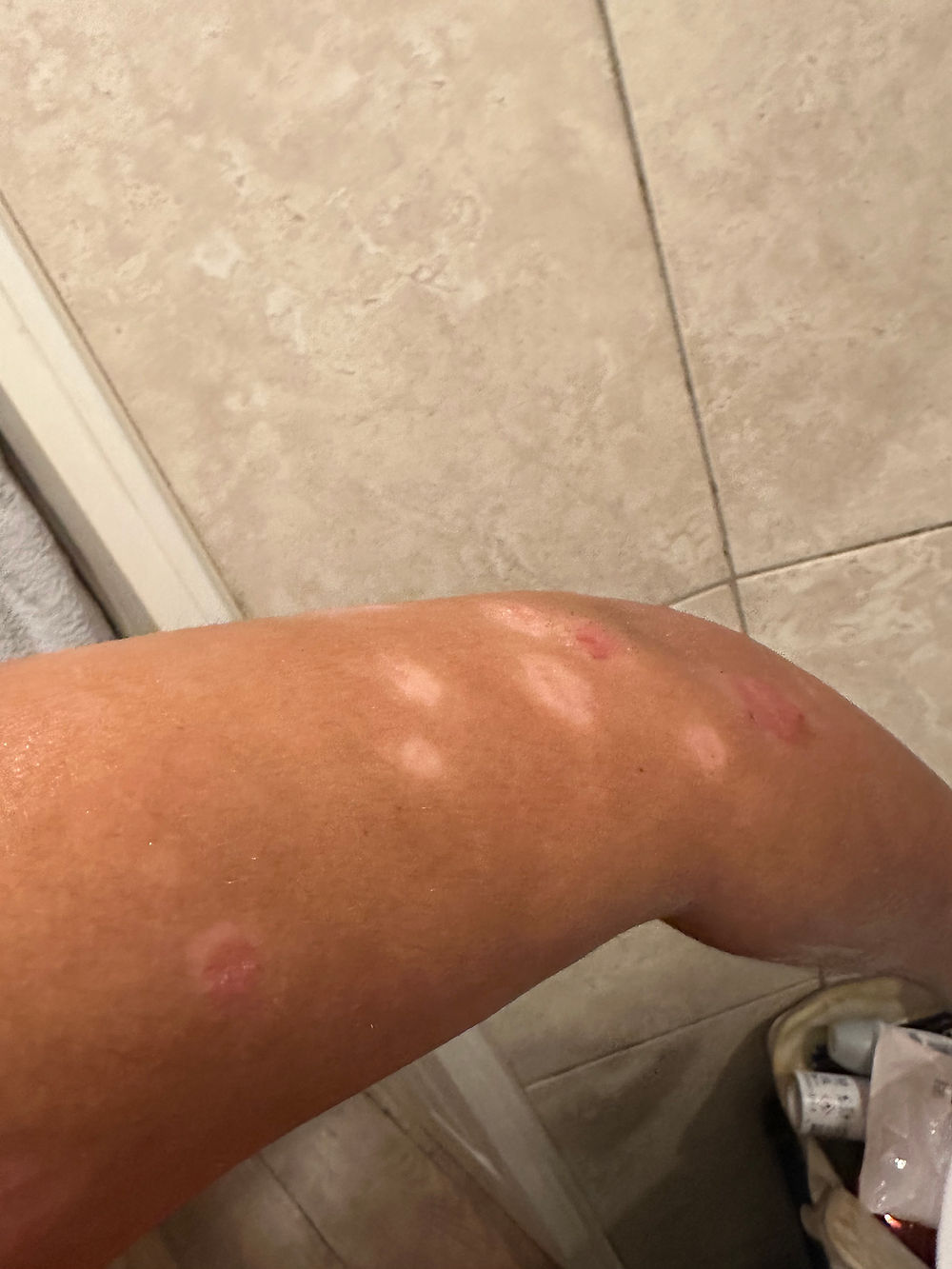
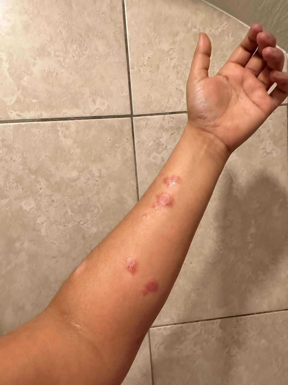
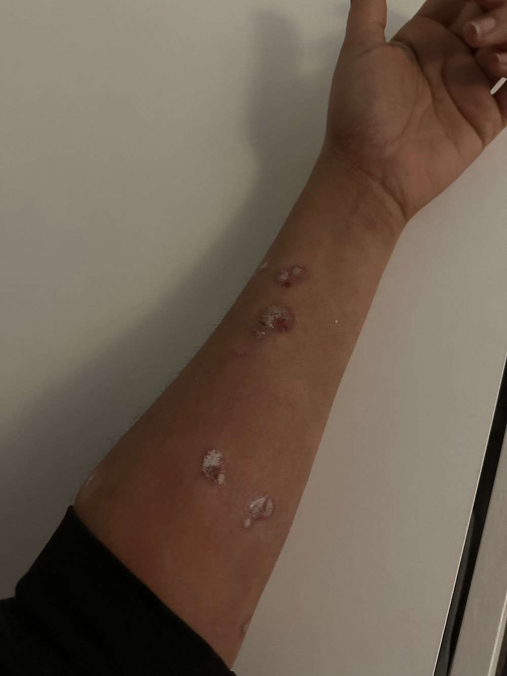
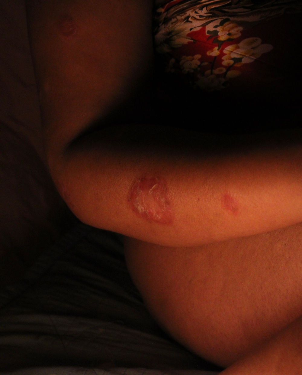
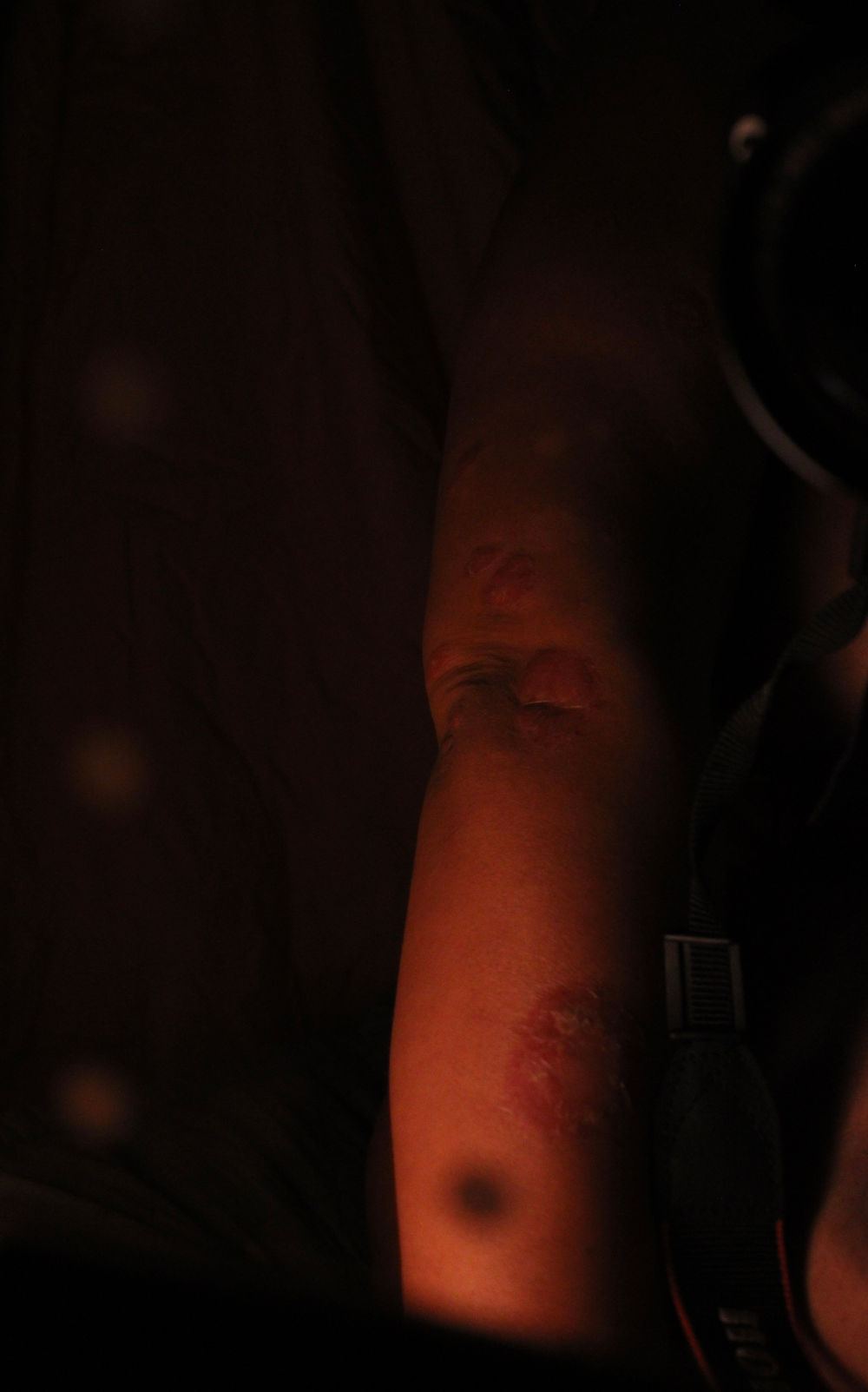
I documented my psoriasis over a three-month period by photographing areas where my flare-ups were at their most severe in order to track how my skin changed over time. This practice helped me develop a greater understanding of the condition and strengthened my awareness of how significantly it is affected by stress, particularly as symptoms worsened closer to project deadlines.
Documenting these changes allowed me to observe the varying colours, stages, and severity of my flare-ups, highlighting how unpredictable and fluctuating the condition can be. It also helped me become more comfortable photographing my skin in all of its stages, whether moisturised, dry, or cracked, which was vital in order to represent my skin as openly and honestly as possible.
This process truly challenged my own prejudices towards my skin. I realised that I felt particularly vulnerable showing my psoriasis when it was dry and un-moisturised, as these were the moments when I felt most exposed and insecure. By continuing to document these stages regardless of discomfort, I was able to confront these feelings directly and develop a more accepting and unbiased perspective towards my appearance.
Overall, this process proved extremely valuable, not only in deepening my understanding of my psoriasis but also in building my confidence in visually communicating and representing my skin through my work.


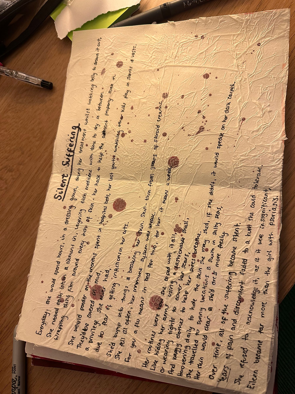


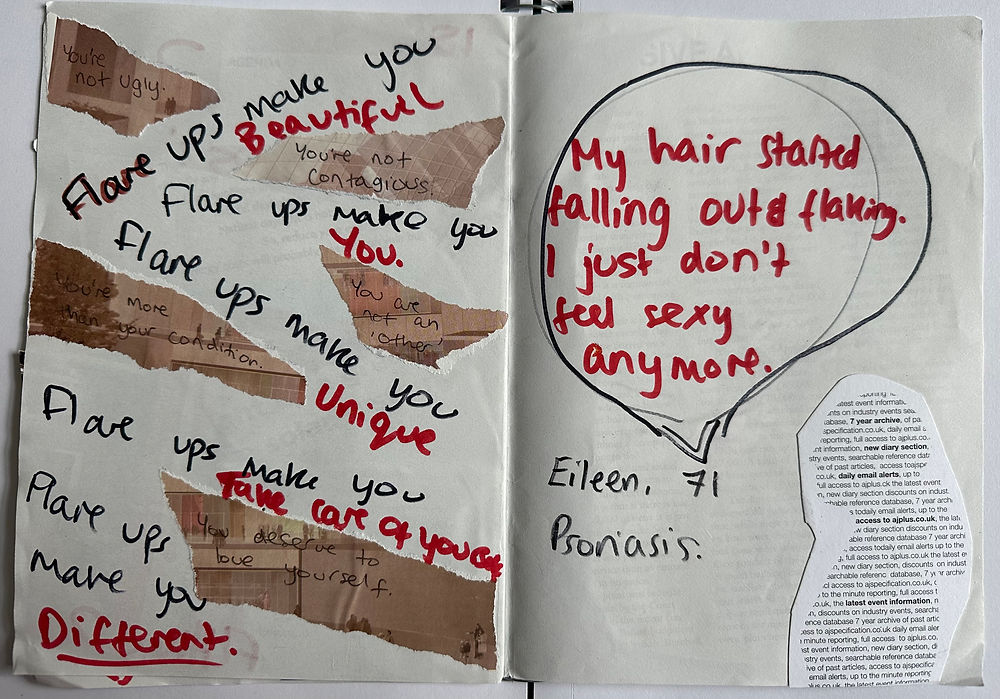
Zine 1 - In Her Skin
I started by creating my grandmother Eileen’s zine, as gathering the images meant the reflections and emotions surrounding the project were still fresh in my mind. I really enjoyed the physical nature of making the zine; the process of layering felt purposeful and rich with meaning. Being able to combine printed photographs with magazine and newspaper collage materials gave the piece a sense of raw emotion and depth, allowing different visual elements to interact and build narrative.
I explored several designs for the front cover, initially experimenting with the organic shapes of psoriasis marks, similar to my indicative outcome. However, this approach felt too one dimensional and unintentionally resembled a cow print pattern, so I decided to pursue other methods. Instead, I began layering torn and folded paper to create both physical depth and a visual reference to the flaky skin buildup associated with psoriasis. I particularly liked how the layering became inviting and interactive. Parts of the title were partially obscured beneath foldable paper pieces, suggesting that the words themselves were “within the skin.” The title In Her Skin, a play on the phrase “putting yourself in someone else’s shoes,” felt especially appropriate, as the project explored my grandmother’s relationship with her skin condition.
Because the piece was entirely physical, every decision to stick something down felt permanent. To keep the process open and experimental, I first built background textures and colour palettes before attaching Post it notes with ideas and reflections for elements I could later layer on top. This allowed the zine to develop gradually without limiting my ability to change direction. I continued using this as a primary technique throughout the development of the final piece, layering together processes of collecting, researching, making, reflecting, and planning.
Overall, this was one of my favourite pieces to create because the process felt visceral, instinctive, and reactive, much like the experience of living with psoriasis itself. In hindsight, I think the execution occasionally felt busy without enough clarity. While the messiness supported the visceral approach, some areas appeared chaotic rather than intentional. To improve this in future work, I began considering when digital and handwritten typography are most effective, as well as exploring a more minimal visual language for my next zine.
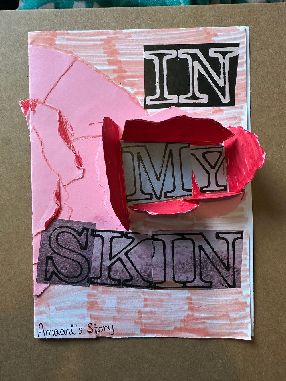

Zine 2: In My Skin - attempt 1
I began creating my zine physically in order to mirror the format of the one produced about my grandmother. However, because the majority of the photographs documenting my own experience were digital, I began considering the possibility of creating the second zine digitally instead. Although the physical version showed strong visual potential, the process of producing entirely handmade material proved time-consuming and messy. As a result, I wanted to explore more refined and controlled methods of presentation, which led me to experiment with a digital format.
This shift also felt conceptually appropriate in representing the generational gap between myself and my grandmother. The contrast between physical print and digital production became a visual reflection of the differences between our experiences, environments, and relationship with self-representation. Using a digital format for my own story therefore strengthened the conceptual framework of the project rather than simply serving as a practical decision.
Although this stage was ultimately considered a failed attempt in terms of the final outcome, elements of the work still informed and inspired later developments within the project. In particular, the first page I created, featuring illustrated eyes on a train, became an important visual reference for my final artist’s book, where I recreated a refined digital version of the image to include within the finished piece.


Zine 2: In My Skin - attempt 2
This piece was particularly successful in conveying my personal journey and allowed me to experiment with digital layering, image manipulation, and composition. Compared to the physical zine, the digital format achieved a far more refined and professional finish. However, this polished appearance also removed some of the emotional rawness and vulnerability that the handmade physical zine naturally conveyed through its imperfections and tactile qualities.
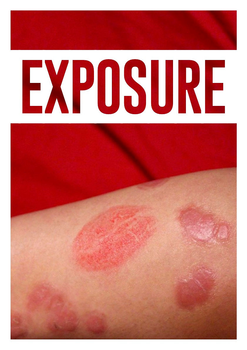
Moving forward, I recognised that both formats offered distinct strengths and limitations. The physical process created a sense of permanence and emotional immediacy, while the digital process often felt more controlled, intentional, and visually polished. As a result, I concluded that combining both approaches through the creation of a magazine would produce a more layered and effective outcome.
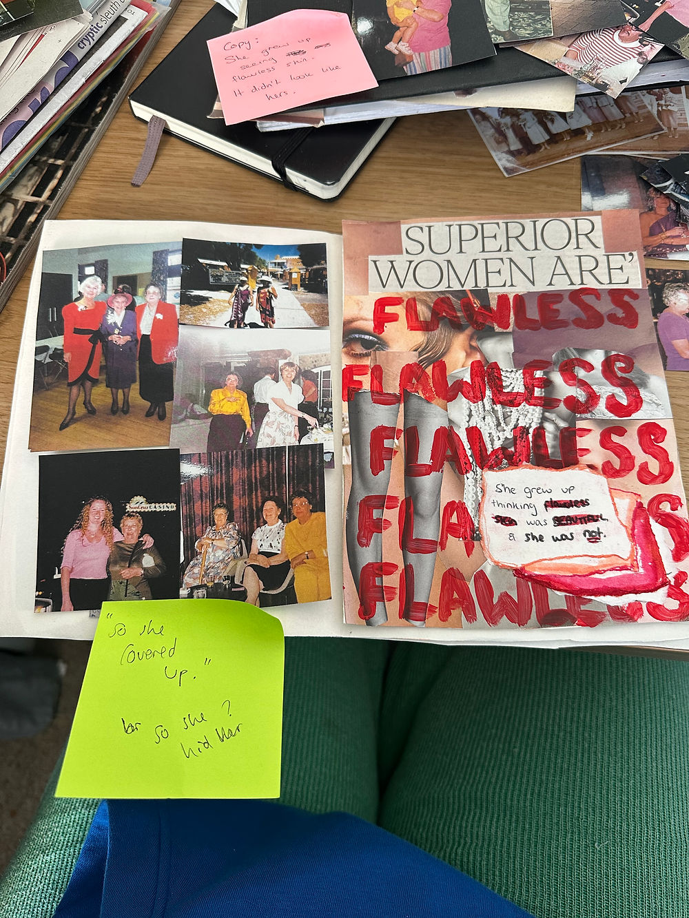
Choosing a magazine format felt particularly appropriate because of its strong association with commercial beauty culture and editorial imagery. Since magazines are often linked to ideals of perfection, beauty standards, and social comparison, using this format allowed me to challenge those conventions by placing psoriasis and visible skin difference within a space that traditionally excludes them. Combining physical and digital techniques within this format also enabled the creative process to feel more varied, authentic, and emotionally resonant through its unfiltered compilation of imagery, reflections, experimentation, and personal documentation.


Responding to Feedback - Exploring Editorial Photography
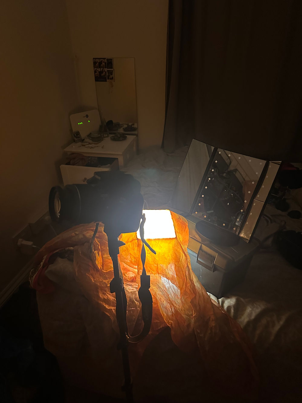
Before beginning this project, I had never independently set up a photography studio or been fully responsible for directing and producing a photoshoot on my own. However, I had developed a strong understanding of photography through practising it as a hobby and further refining my technical knowledge throughout university, particularly during first-year modules such as Visual Thinking and Film and Technologies. These experiences introduced me to key photographic techniques surrounding composition, lighting, framing, and visual storytelling. As a result, I knew that three elements would require careful consideration within my own photoshoots: how I would present myself, the choice of backdrop, and the control of lighting and camera angles.
Although the final studio setup appeared imperfect and somewhat chaotic, these flaws ultimately added depth and meaning to the photographs. For example, the inability to create a completely smooth, wrinkle-free backdrop unexpectedly echoed the texture and appearance of skin itself, reinforcing the themes of vulnerability and imperfection explored throughout the project.
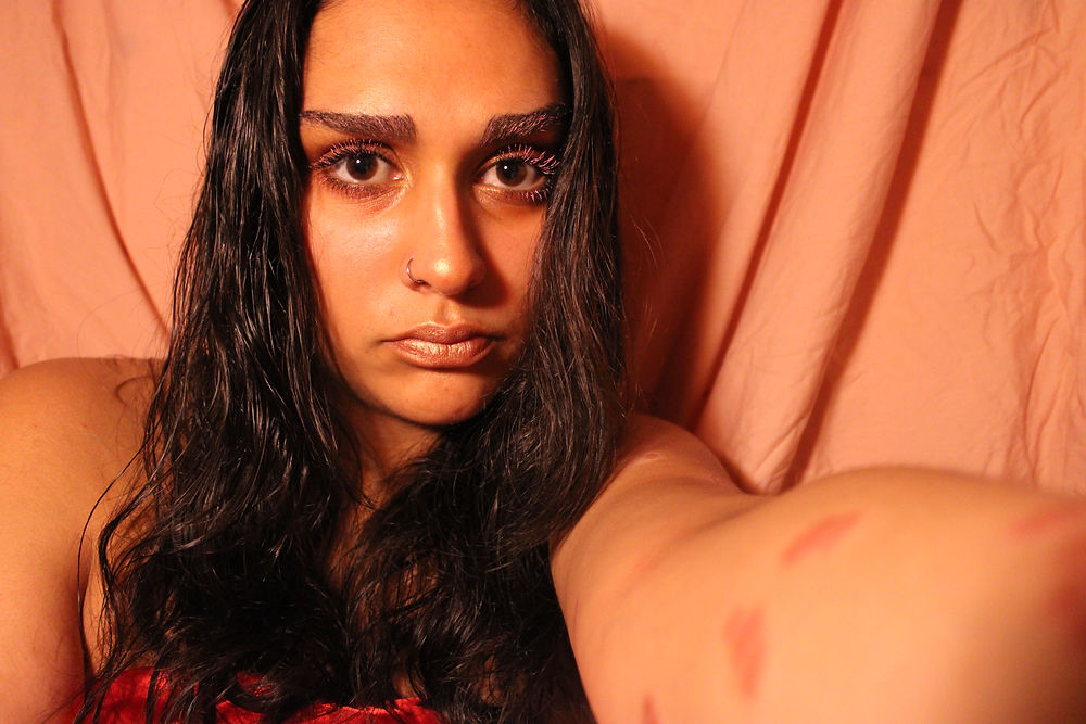
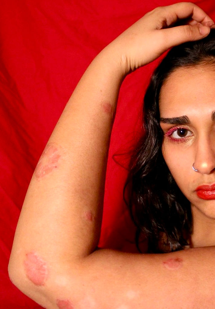
I created a makeshift home studio using a lamp, a bedsheet, my DSLR camera attached to a tripod, and a mirror so I could monitor what I was photographing while shooting self-portraits. The choice of bedsheets as backdrops was particularly intentional and emotionally significant. After developing psoriasis, I purchased new bedsheets because my skin would often bleed and stain them during flare-ups. Before my diagnosis, I had always used white bedsheets, but afterwards I switched to pink and red ones in order to conceal the stains. For the photoshoots, I used both the pink and red sheets as backgrounds.
This was a deeply confronting decision, as the stained bedsheets had become one of my greatest insecurities. Incorporating them into the work forced me to directly engage with something I had previously hidden and associated with shame. At the same time, the transition from white sheets to coloured ones became symbolic of the drastic lifestyle changes psoriasis introduced into my everyday life.
Lighting also became an important part of constructing the atmosphere of the images. I used a pink silk scarf over the lamp to shift the lighting from a harsh yellow tone to a softer peach hue that complemented both the tones within my psoriasis and the makeup used throughout the shoot. This created a warmer and more cohesive visual palette while softening the emotional intensity of the portraits.
The makeup choices were equally deliberate. I selected pink and gold tones that harmonised with the lighting, backdrop, and the natural colouring of my skin during flare-ups. Glitter was incorporated to create an ethereal quality inspired by the editorial portraiture of Ian Lim and George Kroustallis. This contrast between visible skin damage and stylised beauty elements allowed me to challenge conventional perceptions of attractiveness and create portraits that felt both vulnerable and empowering.
Overall, this process became far more than simply documenting my psoriasis. It allowed me to transform deeply personal insecurities into carefully considered visual narratives. By intentionally incorporating objects, colours, textures, and imperfections connected to my experience, I was able to create photographs that not only documented the physical reality of psoriasis but also communicated the emotional and psychological impact it has had on my identity and self-perception.


Photoshoot 1
The results of this photoshoot were far more successful than I had anticipated and, upon reflection, the process genuinely improved my confidence and self-image. Taking on feedback to explore an editorial approach proved particularly effective when addressing psoriasis, as it felt like a powerful format through which to represent skin conditions. Beauty and fashion magazines have historically been significant sources of social comparison and insecurity for people with visible skin conditions, so reclaiming this visual language felt both meaningful and empowering.
One of the most successful aspects of this practice was framing psoriasis as something that could be seen with confidence rather than shame. The carefully considered colour palette created a strong visual language that immediately captured attention, while the vulnerability required to produce the images ultimately felt worthwhile because of the confidence and empowerment it generated afterwards. This process made me reconsider how I wanted to portray my skin throughout the project. Feeling proud of the photographs made me realise how important it was to create work that could potentially encourage or inspire others with psoriasis to feel more confident within their own skin. By showing that photographing psoriasis openly and confidently can be rewarding, even when it initially feels uncomfortable or exposing, the work began to take on a more hopeful and empowering purpose.
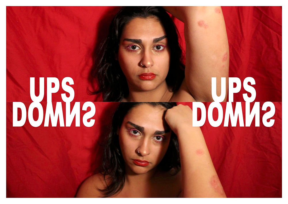
I particularly appreciated the softness and romanticism within this photoshoot, as it presented my skin and self-image in a gentle and compassionate way. However, I also recognised the importance of representing the harsher and more uncomfortable realities of psoriasis in order to remain honest and transparent. While the images appeared calm and serene, they did not fully communicate the physical discomfort of living with the condition, particularly the constant irritation and itchiness that accompanies flare-ups. This contrast made me aware that the photographs only represented one side of the experience.
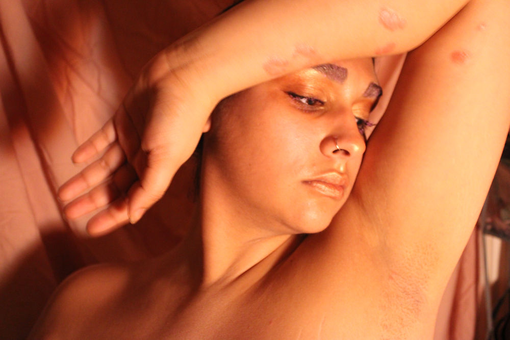
As a result, I decided to produce a second photoshoot using the red bedsheet backdrop in order to convey a more visceral and emotionally intense representation of psoriasis. Through this shoot, I aimed to communicate feelings of irritation, discomfort, frustration, and ownership, creating a more balanced and truthful portrayal of the condition and my lived experience with it.


Photoshoot 2
The second photoshoot proved to be just as successful as the first, if not more impactful. I approached the self-shoot in a similar way, again using my red bedsheet as a backdrop alongside a tripod and a lamp softened with a scarf to control the lighting and colour tone. Maintaining this setup allowed the photographs to remain visually connected to the earlier shoot while developing the project’s themes further.
What made these images particularly powerful was the sense of visual unity they created. My skin, makeup, and surroundings felt harmonised, forming a cohesive composition rather than allowing my psoriasis to appear isolated or out of place. This contrasted significantly with my everyday experience, where my skin often feels like the one aspect of my appearance that stands apart from everything else. Through this shoot, my psoriasis felt integrated into my identity rather than existing as something separate from it. The outcomes also confirmed the project’s developing colour palette, which had become strongly centred around pink, red, black, and white.
One of the most significant points raised during peer feedback was how the use of red disrupted its more conventional associations with anger, danger, or lust. Instead, the colour became symbolic of empowerment, confidence, and reclamation. The red tones intensified the sorest areas of my skin, while the bold makeup and direct eye contact conveyed a sense of dominance and unapologetic self-expression. This transformation of red into a colour associated with self-acceptance and strength became an important conceptual development within the project.
However, there were still aspects of experimentation that proved less successful. I attempted to visually communicate the sensation of itchiness within some of the photographs, but the outcomes appeared overly theatrical and unintentionally comical, which reduced the emotional seriousness of the imagery. Despite this, I chose to include one of these photographs within the magazine mock-up presented during the critique. Showing unsuccessful experimentation felt important, as it encouraged further creative feedback and opened discussion around how these ideas could potentially be communicated more effectively in future developments of the work.


Using InDesign for Both Magazines
In order to design the magazines, I worked primarily in Adobe InDesign. Although I was already familiar with the basic tools and interface, I did not feel fully confident creating editorial layouts entirely from scratch. In previous projects, I had designed individual zine pages in Adobe Photoshop before transferring them into InDesign to format them into a booklet. However, for this project I decided to create the magazine entirely within InDesign as a way of developing both my technical confidence and editorial design skills.
Working directly in InDesign proved extremely beneficial, particularly when it came to creating cleaner layouts, organising typography, and formatting pages consistently. The software also made it significantly easier to structure and export booklet formats professionally, which improved both the workflow and the overall presentation of the magazine.
Using InDesign was also important for the development of the Exposure logo and title design. The cut-out typography style was easier to create digitally within the software, while still allowing me to incorporate hand-drawn marks and manual edits to maintain a more personal and expressive aesthetic. This combination of digital precision and handmade intervention reflected the wider themes of the project, where polished editorial aesthetics were balanced with emotional vulnerability and personal documentation.
Additionally, the print quality achieved through designing directly in InDesign was noticeably stronger and more refined than in previous outcomes. The sharper formatting, cleaner composition, and improved image resolution contributed to a more professional final product while still preserving the emotional and conceptual depth of the work.


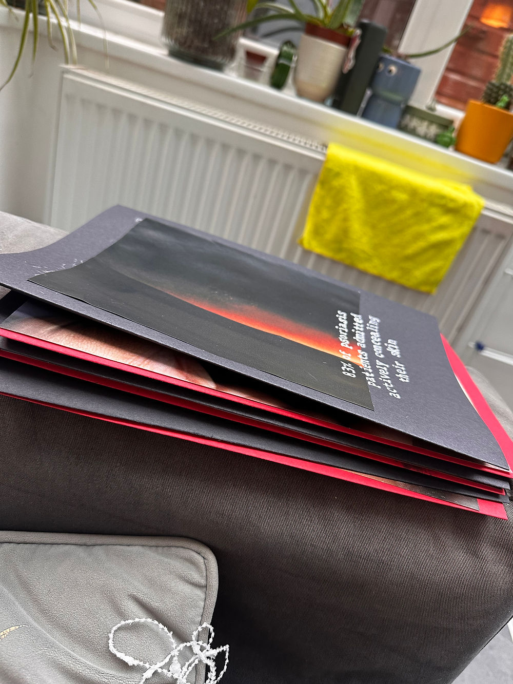
Exposure Magazine Edition 1&2
The magazines successfully represented both the positive and more difficult aspects of my relationship with psoriasis. I particularly liked the continued use of roses as a recurring visual motif, this time incorporated in a more abstract and symbolic way. The imagery created a balance between beauty and discomfort, reflecting the duality of living with a visible skin condition. I also found the contrast between the clean, formatted typography and the handwritten text especially effective, as it highlighted the difference between what is publicly understood about psoriasis and the more personal, unspoken realities of living with the condition.
However, there were still elements that proved less successful. In particular, some of the copy and imagery within the second edition lacked cohesion. While the visual language of the photographs felt unified and intentional, sections of the written content appeared inconsistent in tone and style. Reflecting on this made me realise that I needed to return to my research studies and gather more direct, impactful material from both my interviews and external surveys in order to create a stronger sense of shared experience surrounding psoriasis.
As a result, I recognised that future editorial work would benefit from simpler and more focused written content. Rather than relying on overly complex phrases or abstract statements, I decided that the copy should either communicate emotionally honest experiences that are widely relatable to people with psoriasis or provide informative content such as contextual information, quotes, or statistics. This would allow the work to feel more accessible, cohesive, and representative of a broader collective experience rather than solely my individual perspective.


Crit
I intentionally kept the presentation relatively simple in order to prioritise refining the content and layout of the magazines themselves. While this allowed me to focus more attention on the editorial design and written material, reflecting on the outcome made me realise that I need to explore more adventurous and immersive methods of presenting my work in the future. Developing more dynamic approaches to installation and display could strengthen the emotional impact of the project and create a more engaging experience for the audience.
The feedback I received highlighted several important areas for development. One suggestion was to improve the print quality further in order to strengthen the professional and editorial feel of the magazines. I was also encouraged to reconsider the use of white within the colour palette, as it was perceived as empty or inactive space within the compositions. Instead, feedback suggested focusing more heavily on red as the dominant visual language, as its intensity and emotional impact felt far stronger and more visually distinctive than the combination of red and pink together.
Overall, the responses to the work were extremely positive, particularly regarding the poetry and written reflections included throughout the magazines. These elements resonated strongly with viewers and reinforced the emotional honesty and vulnerability within the project. As a result, I decided to continue combining visual and written work, but to develop it further through the format of an artist’s book, as suggested by my lecturer, Mim. A book felt like an especially appropriate next step for several reasons. Conceptually, the progression from zine to magazine and finally to book reflected the growing depth and refinement of the project itself. More personally, it also created a meaningful connection to my grandmother, who, as mentioned within the interview transcripts, worked as an apprentice bookbinder for seven years. Incorporating the format of a book therefore felt like a particularly full-circle moment within the project, connecting both our experiences through the physical form of the final outcome.
Printing with Plotters
I had to learn how to use the large-format plotter printers in order to produce high-quality photographs from my photoshoots for my artists book. Becoming familiar with this printing process was extremely useful, as the plotters quickly became some of the most frequently used printers throughout the remainder of my project. Developing confidence with the equipment also allowed me to have greater control over print quality, colour accuracy, and the overall presentation of my work.
In hindsight, I think both the magazines and photographs would have benefited from being printed on glossy paper rather than standard stock. A glossy finish would have strengthened the editorial and commercial aesthetic I was aiming to achieve, making the outcomes feel even more authentic to the visual language of contemporary beauty and fashion magazines. Reflecting on these material choices made me more aware of how significantly paper type and print finish can influence the perception and professionalism of a final outcome.
Art Book and Risograph Printing Consultation with Francis


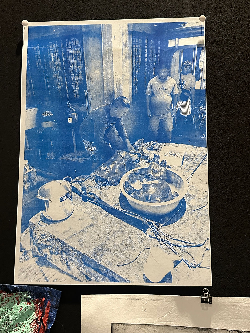


In order to gain a better understanding of which techniques and processes I could explore for the next stage of the project, I consulted with Francis, an artist and technician at university, for advice on possible approaches to developing my artist’s book. Before beginning to experiment with materials, I wanted to ensure I fully understood the practical considerations involved in bookmaking, including appropriate paper thickness, material choices, and the equipment required for bookbinding. These discussions were particularly useful in helping me approach the production process more thoughtfully and professionally before investing in materials and construction.
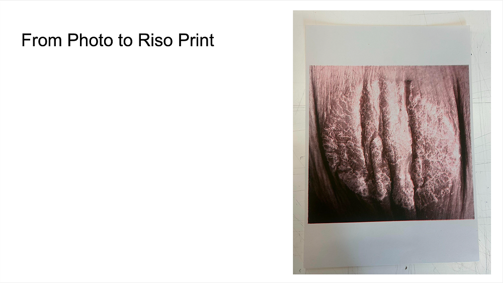
Francis also introduced me to the process of risograph printing, and together we discussed the potential of photographing my skin at an extremely close range in order to explore the patterns, textures, and abstract imagery that could emerge through the printing process. This conversation encouraged me to think about my skin in a more experimental and less literal way, moving beyond straightforward documentation.
The consultation generated a wide range of creative suggestions, including scanning my skin directly, creating handmade paper inspired by the texture of skin, and photographing my skin through a landscape-based visual narrative in order to challenge how skin is viewed in relation to identity and selfhood. One of the most valuable outcomes of the discussion was the reassurance that I could incorporate a broad range of practices within the project, as long as they maintained conceptual relevance to my research and experiences. With this in mind, I decided to move forward with experimenting through papermaking and photographing my skin in more abstract ways, intentionally separating it from recognisable aspects of my identity.


Attending The Festival of Photography in Greenwich
In order to further explore photography within my practice, I attended the Festival of Photography at University of Greenwich. The event included talks from emerging photographers, Ethan Parker and James Manning, who had received awards and showcased work that naturally commanded the audiences attention. Much of the photography presented focused on publication-based imagery, including editorial and photojournalistic work, which exposed me to a wide range of both highly constructed and spontaneous approaches to image-making.
One of the most significant ideas I took away from the festival was the concept of photography as a form of framing. The speakers discussed how photographers have complete control over what is included within the frame and what is excluded, and how this decision ultimately shapes meaning and narrative. I became particularly interested in the idea of the frame as a metaphor for storytelling, capturing only a fragment of a wider experience while still communicating something emotionally or conceptually powerful.
Following the festival, I began considering how I could frame my skin differently within my own photographic practice. After previously discussing the idea of exploring skin as landscape imagery with Francis, I started to think more deeply about how photography could abstract and redefine the body.


Shooting my skin close-up
This different approach to framing my skin led me to experiment with photographing it at an extremely close range, removing recognisable aspects of my identity so that the skin could be viewed independently from the body itself. By abstracting these details, I was able to reconsider my psoriasis not simply as a medical condition attached to my identity, but as a texture, surface, or landscape that could be interpreted in multiple ways through the photographic frame.
What I particularly appreciated about these photographs was the gentleness with which they represented my skin, despite documenting it in one of its most painful states: cracked, dry, and sore. The softness of the imagery created a sense of care and sensitivity rather than focusing purely on discomfort or medicalisation. This balance allowed the photographs to communicate vulnerability without appearing overly clinical or harsh.
The inclusion of the red T-shirt also helped maintain visual consistency with the wider project’s established colour palette. Carrying the red tones throughout the imagery reinforced the emotional and conceptual language that had developed across the magazines and photoshoots, ensuring the photographs still felt connected to the broader body of work.
The next steps I wanted to explore with these photographs involved experimenting further with how they could be transformed and developed visually. In particular, I was interested in using the images for risograph printing, as the textured and layered qualities of the process felt well suited to the abstracted appearance of the skin. I felt that the imperfections, grain, and colour intensity produced through risograph printing could enhance the tactile and organic qualities already present within the photographs. I also wanted to experiment with layering additional materials and written copy over the images in order to reintroduce aspects of my identity back into the work in a more conceptual way. Since the close-up framing had intentionally removed recognisable features of myself, layering text, reflections, or other visual elements onto the skin imagery became a way of reconnecting the photographs to personal narrative and lived experience, allowing the work to balance abstraction with intimacy.


Learning how to bind a book
Understanding the fundamentals of bookbinding was essential so that I could make informed decisions about the materials and techniques I wanted to explore, while also ensuring that the book I designed would actually be possible to bind successfully. Different binding methods require different tools and materials, so developing a clear understanding of the process helped me refine my ideas and make practical choices. I already knew that I wanted an exposed spine and red thread as key visual elements, but researching bookbinding techniques helped me identify the most suitable materials to achieve this effectively. For example, I learned that waxed thread would provide greater durability and tension when sewing the pages together, and I also discovered the specific needles and tools required to create the holes for stitching.


Buying and Collecting Materials for Art Book
Collecting materials became quite a gradual and exploratory process. After researching bookbinding techniques and suitable materials following my discussion with Francis, I realised that my options were much broader than I had initially expected. My interest in texture and layering encouraged me to experiment with a variety of techniques, including papermaking, lino cutting, and sewing, all of which influenced the direction of the final book.
When sourcing materials, I made a conscious effort to mainly select items in red because I wanted the book to be saturated with the symbolic meanings connected to the colour. These references included the Japanese red string theory, the visual identity of raised reddened skin and blood, and the idea of red being reclaimed as a colour of empowerment. It was important that the book itself embodied these meanings visually, as the book was intended to act as the centrepiece of the exhibition. Because of this, I wanted it to be the “reddest” object in the space, allowing it to stand out and carry the emotional weight of the project.
The materials I collected included red waxed thread, a lino cutting set with ink, textured and coloured papers such as felt and GF Smith papers, several adhesives including double-sided tape, Pritt Stick, and PVA glue, as well as varied sizes of deckles for paper-making. I also had to carefully consider the thickness and durability of the materials I used. For example, I aimed for relatively thin card so that puncturing holes through multiple layers would not be too difficult, while the waxed thread I selected was intentionally thick so that the exposed stitching would remain highly visible and strong enough to support the weight of the pages.
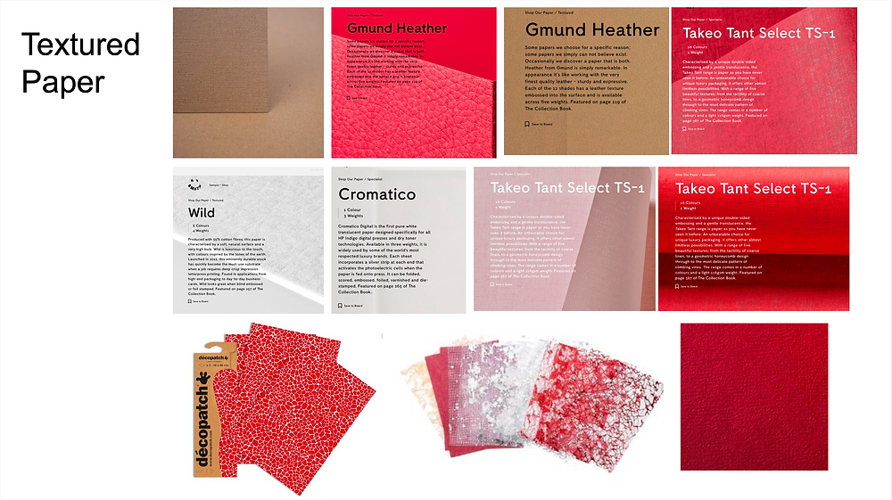
I began researching textured paper quite early on after Mim suggested looking into GF Smith papers during a supervision discussion. I ordered a range of free samples and found that many of the leather-like textures and vibrant reds worked extremely well within the book, helping certain elements stand out visually. However, some of the brown and beige papers I received did not convey the sense of skin and texture that I had originally hoped for. Instead, I repurposed these as scrap or background papers within the project. I also ordered textured papers from Amazon, although I made the rookie mistake of not checking the dimensions properly and accidentally ordered A6 instead of A4 sheets. Despite this, the papers still had useful textures, so I incorporated them into smaller layered details throughout the book.
In conclusion, this project has been incredibly valuable in pushing me to learn new methods and become more confident working with a wide range of materials and techniques. Throughout the process, I experimented with different approaches to bookbinding, texture, layering, and printmaking, all of which helped me develop both technically and creatively. Although some ideas and materials did not work in the way I had originally intended, each mistake still contributed something useful to the project. In many cases, unsuccessful materials were repurposed into backgrounds, textures, or layered elements within the book, allowing them to still hold value within the final outcome. Overall, every stage of experimentation contributed to the development of the book, helping shape it into a more thoughtful, personal, and visually rich final piece.
Crit 3
I presented a short presentation outlining my planned next steps over the Easter break, where I discussed the different materials and techniques I had either researched or already experimented with. I spoke about the styles of stitching and bookbinding that I was drawn to, as well as the printmaking techniques I was exploring throughout the project. One of the processes I reflected on was risograph printing, which ultimately was not as successful as I had hoped. Although visually interesting, the outcome felt too impersonal and clinical, which conflicted with the emotional and intimate tone I was trying to achieve within the project.
During the presentation, I also discussed how I had begun collecting flakes of skin that naturally shed from my body to incorporate into the work. Sharing this with my course mates initially felt extremely uncomfortable and embarrassing, and I even found myself apologising while speaking because I worried people would react with disgust or discomfort. However, the responses I received were unexpectedly supportive and genuinely moving. My lecturer, Hannah, raised an important point about how I should not feel apologetic for something that is naturally part of me. She commented on how strange it is that, as humans, we often become disgusted by parts of the body once they are detached from it.
That feedback stayed with me and significantly shifted my perspective on the project. Since then, whenever I feel embarrassed or notice people reacting uncomfortably when I explain that I am making paper using my skin, their reactions have instead become motivation for why I want to make the work in the first place. My condition is something I cannot control, and although everyone sheds skin naturally, mine simply happens in a much larger and more visible quantity. The project therefore became not only a personal exploration but also a way of challenging discomfort, stigma, and perceptions surrounding the body.
Peer feedback was also incredibly valuable throughout this process. Many people found the idea of physically collecting and using my skin as a way of quantifying what falls from my body particularly powerful and thought-provoking. Feedback from lecturer Sarah also reinforced the importance of documenting unsuccessful experiments, as reflecting on what had not worked was equally helpful in understanding what directions and techniques were proving most effective within the project.


Experimenting with Thread and Stitching
Following inspiration from the Japanese red string theory, I continued experimenting with the use of red thread by sewing directly onto paper. In order to familiarise myself with this new technique, I began by testing a variety of the different threads I had collected. I created sample pages divided into sections and stitched each area using different threads to compare how they moved through the paper, whether they caused tearing, and how visible and readable the stitching appeared visually. Alongside each sample, I wrote notes reflecting on what I liked and disliked about each thread. This process helped me identify which materials were the most successful and guided my decision on which thread to use in the final book. The thinner threads were less effective because they were more likely to wrinkle or damage the paper after being pulled through repeatedly.
I then printed photographs of my skin that I had taken and began sewing into the printed surfaces. Initially, I experimented with only a single stitched line to observe how the thread interacted with the inked paper. Surprisingly, the process worked quite smoothly, as the freshly inked paper remained soft enough to reduce tearing when pushing the needle through. After creating the first stitched detail, I photographed the page and used the editing tools on my iPhone to digitally draw additional red lines over the image. This allowed me to visualise and plan potential stitching directions and compositions before physically sewing into the page, helping me determine which placements and stitch patterns were most visually effective.
These experiments were extremely useful in identifying the most successful stitching techniques while also helping me become more confident and familiar with the materials I was working with. Through repeated testing and reflection, I developed a better understanding of how the thread, paper, and printed imagery could work together both structurally and visually within the final book.
Sewing on Printed Photos
This became one of my favourite outcomes from the entire project because of how successfully the stitching communicated both the physical and emotional experience of psoriasis. I particularly liked how the raised stitching echoed the bumpy, inflamed texture of psoriasis flare-ups, while also drawing immediate attention to the surface of the skin in the same way psoriasis itself often attracts unwanted attention. The stitched lines appeared to border and contain the skin, symbolising the restrictive nature of the condition and the way it can make the body feel trapped or constrained.
In one of the pieces, I tied the thread into a bow to reference the sensation of skin tightening around the edges as it dries. This tightening can become extremely uncomfortable and mentally consuming, creating a constant awareness of the body that is difficult to ignore. The bow therefore became symbolic of that tension and restriction , similar to the feeling of standing in a crowd trying to appear calm and unaffected while internally feeling irritated, uncomfortable, and hyper-aware of your skin.
I believe this outcome was particularly successful because it carried such a strong level of meaning while remaining visually striking. The combination of stitching, texture, and imagery allowed the work to communicate both the visible surface of psoriasis and the internal emotional experience connected to it.
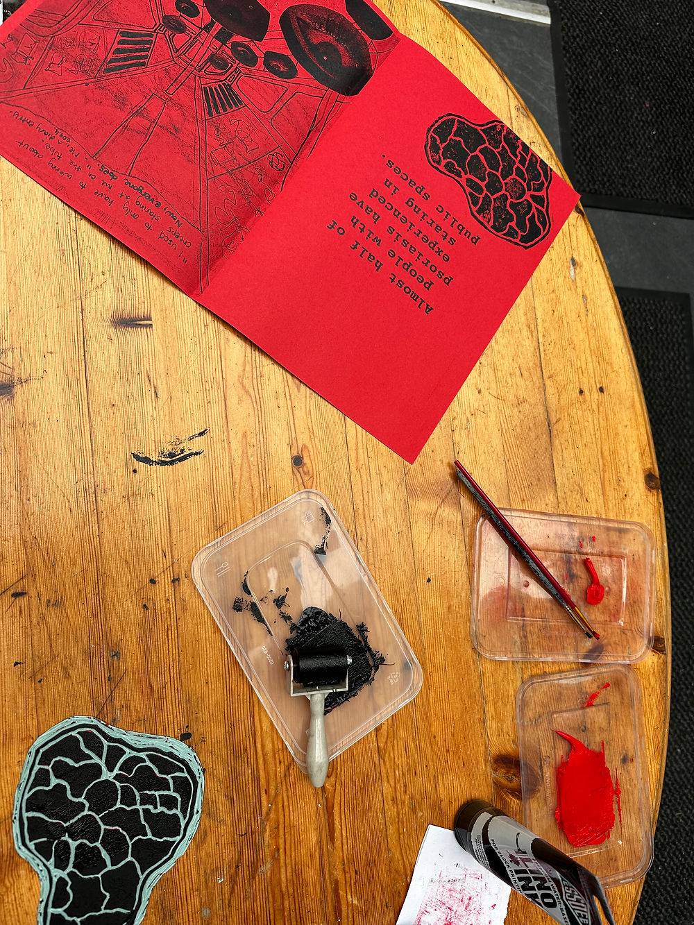
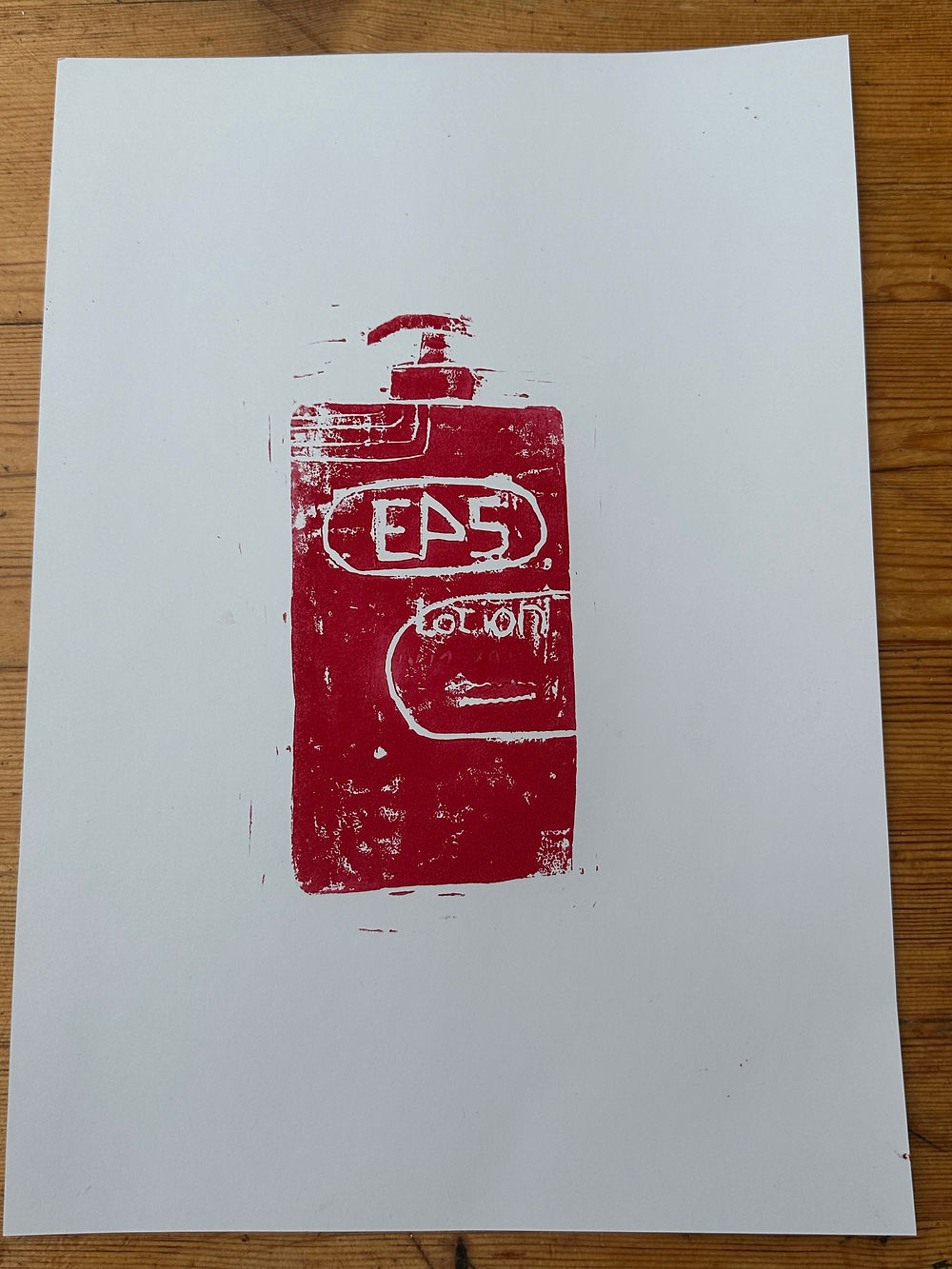
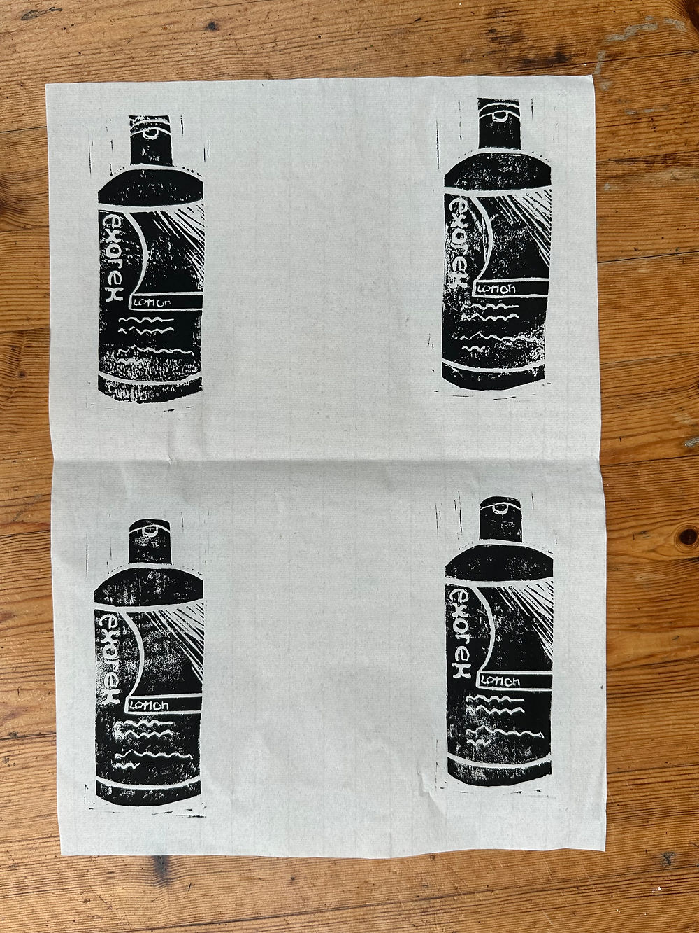
Linocutting
I had previously experimented with lino cutting during secondary school, but because it had been such a long time since I last used the technique, I refreshed my knowledge by watching YouTube tutorials and revisiting the basic carving and printing processes. Thankfully, it was quite a simple technique to re-learn, and the process came back to me quickly once I began experimenting again. This allowed me to rebuild confidence with the materials before beginning my own experiments.
There were some flaws in my initial lino prints, particularly with lettering appearing backwards because I had accidentally carved the text in reverse incorrectly. However, I actually appreciated these imperfections and felt that the flawed quality added character to the work. The mistakes made the prints feel more human and experimental rather than overly polished, which suited the raw and personal nature of the project.
I initially began experimenting with carving shapes inspired by psoriasis marks and flare-ups, but I became frustrated because the forms started to resemble decorative floral patterns similar to Tudor roses rather than communicating the visual identity of psoriasis. Because of this, I went back to reconsider what other visual elements and associations psoriasis could have. I realised that one of the most recognisable parts of living with psoriasis is the constant use of ointments, creams, and treatments applied to the skin. This led me to explore the idea of creating prints using these medical products and their forms, transforming something usually viewed as clinical and unglamorous into something visually engaging and almost decorative.
Although the lino print outcomes were visually interesting, I ultimately felt they lacked the same emotional impact and intensity that some of my other techniques, such as stitching and paper making, were able to communicate. As a result, I decided to use the lino cutting as supporting visual elements within the book rather than as major standalone pieces, such as using the lined texture to give pages texture.
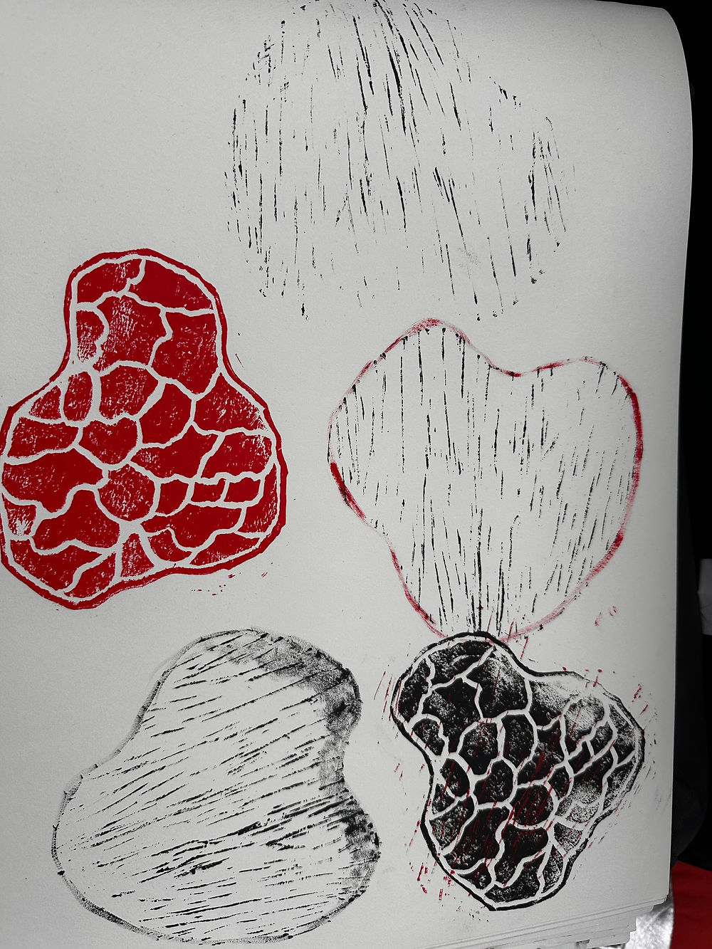
In exploring texture further, I created additional psoriasis prints, this time experimenting with entirely different styles inspired by a page in my book that used concrete poetry, where the poem was shaped like psoriasis patches. One print explored a scratchy texture, while another focused on a scaly texture. I also experimented with combining the two styles, but I found the outcome less successful, as the imagery became unclear and visually confusing.
This second attempt, however, proved highly successful in creating visual detail for pages that required more layering, while also helping to establish a stronger sense of consistency throughout the book’s design.
Ultimately, this process was incredibly valuable, as it expanded the range of textures, imagery, and experimentation present across the project.
Typography for Book
I researched concrete poetry following a suggestion from my supervisor, Mim, to incorporate it into my book. Concrete poetry particularly interested me because it explores the relationship between text and image, allowing words to become visual elements as well as written language. I was drawn to the idea that typography, layout, and shape could communicate emotion and meaning in a way that extends beyond the words themselves.
This research became a major inspiration for how I chose to present the poems, reflections, and factual material I collected throughout the project. Rather than presenting information in a traditional format, I wanted the arrangement of the text to contribute to the experience of reading the work. I found that using language visually could create a stronger emotional impact and help communicate the physical and emotional experience of living with psoriasis more effectively.
For example, when looking at examples of concrete poetry, I began experimenting with arranging lines from my poems into shapes that resembled psoriasis on the skin. This approach became particularly successful because the words themselves reflected thoughts and feelings connected to my condition, while the visual form mirrored the texture and spread of the psoriasis. By combining meaningful language with visual representation, the poems became more immersive and personal, allowing the reader to engage with both the appearance of the skin and the emotions attached to it simultaneously.
This process helped me understand how design and writing can work together to communicate sensitive experiences in a more powerful and expressive way.


Sewing Typograph
Following a call with my supervisor and lecturer Mim, I began exploring how typography could be incorporated into my book. One of the biggest inspirations during this stage was Barnbrook Bible, particularly the way typography and physical processes could work together to create expressive and tactile forms of communication. This inspired me to experiment with using sewing as a method of creating text and copy within the pages of the book.
I really enjoyed the process of making the sewn typography page, especially because it combined two areas of the project that interested me most: tactile materials and visual communication. However, although the process itself was engaging, I felt slightly disappointed with the final outcome. The page appeared too one-dimensional and lacked the depth and visual impact that some of my other experiments achieved. Originally, I had only intended for the page to contain a stitched definition, but once assembled it felt visually empty and somewhat boring. Because of this, I began exploring ways I could introduce more depth and layering to the composition in order to make it feel more engaging.
Another issue was the amount of time required to complete the stitched typography in comparison to the overall impact of the outcome. While the process was careful and labour-intensive, I found that sewing directly into photographs and textured imagery produced far more visually powerful and emotionally meaningful results. As a result, I decided not to continue pursuing sewn typography as a major technique beyond that particular page, although the experiment itself was still valuable in helping me understand which methods were most effective within the context of the project.
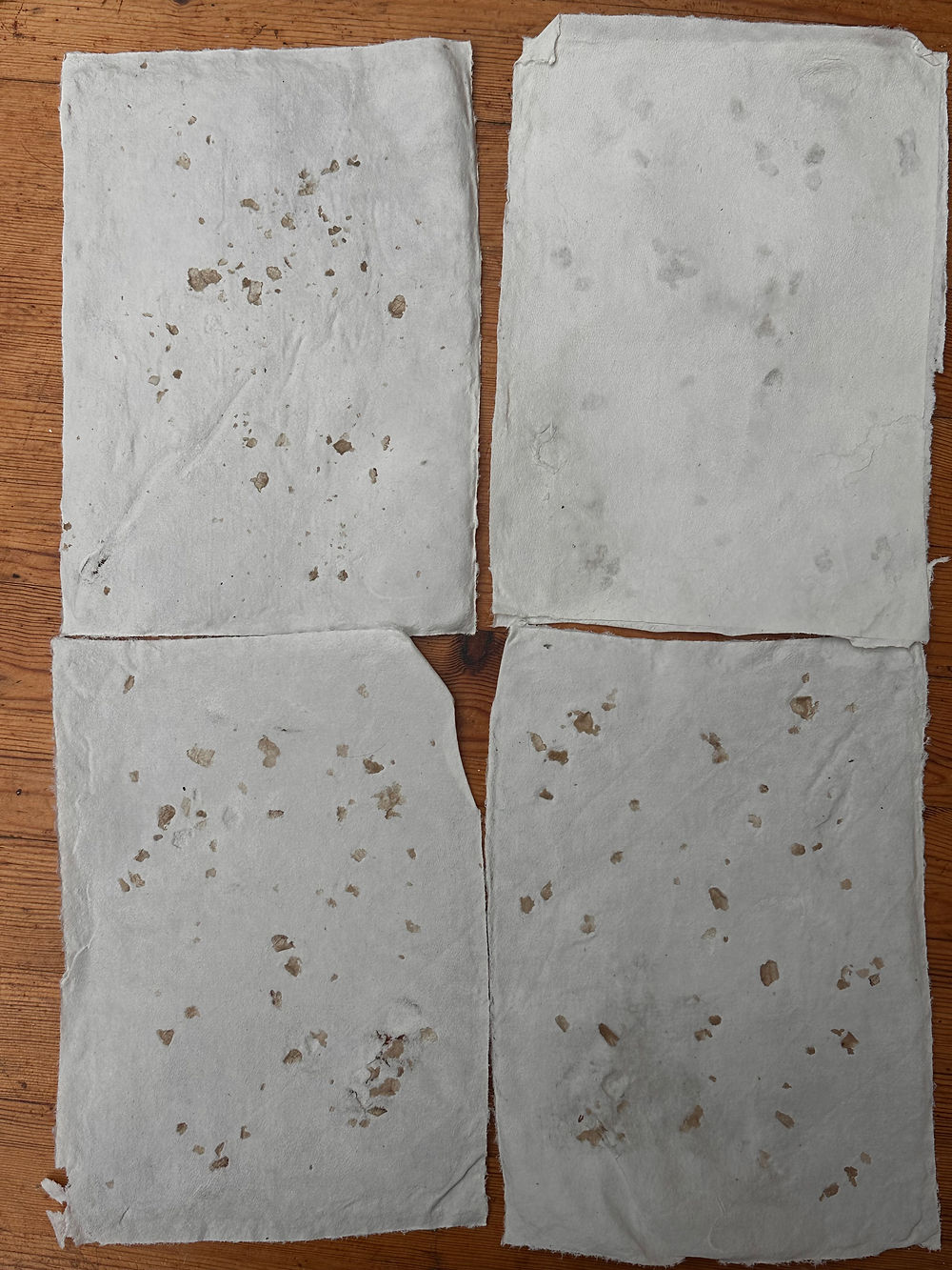
Making Paper mixed with my skin
In order to research papermaking, I watched a range of YouTube tutorials to understand both the process and the materials required. Very early on, I became aware that cotton sheets or fabric were necessary for transferring and drying the handmade paper. As I did not have any suitable fabric at hand, I decided to tear up an old white bedsheet that had become stained from my psoriasis when I first developed the condition. This felt like a particularly meaningful part of the process because the sheet had been hidden away at the back of my wardrobe for years, as I had avoided using white bedding ever since staining it. Repurposing it within this project and using it to celebrate rather than hide my skin felt very full circle and emotionally significant.
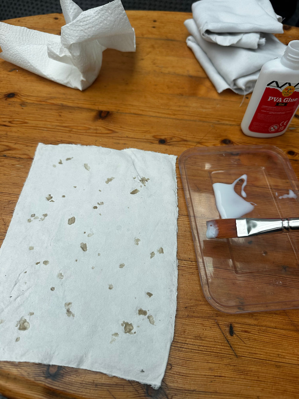
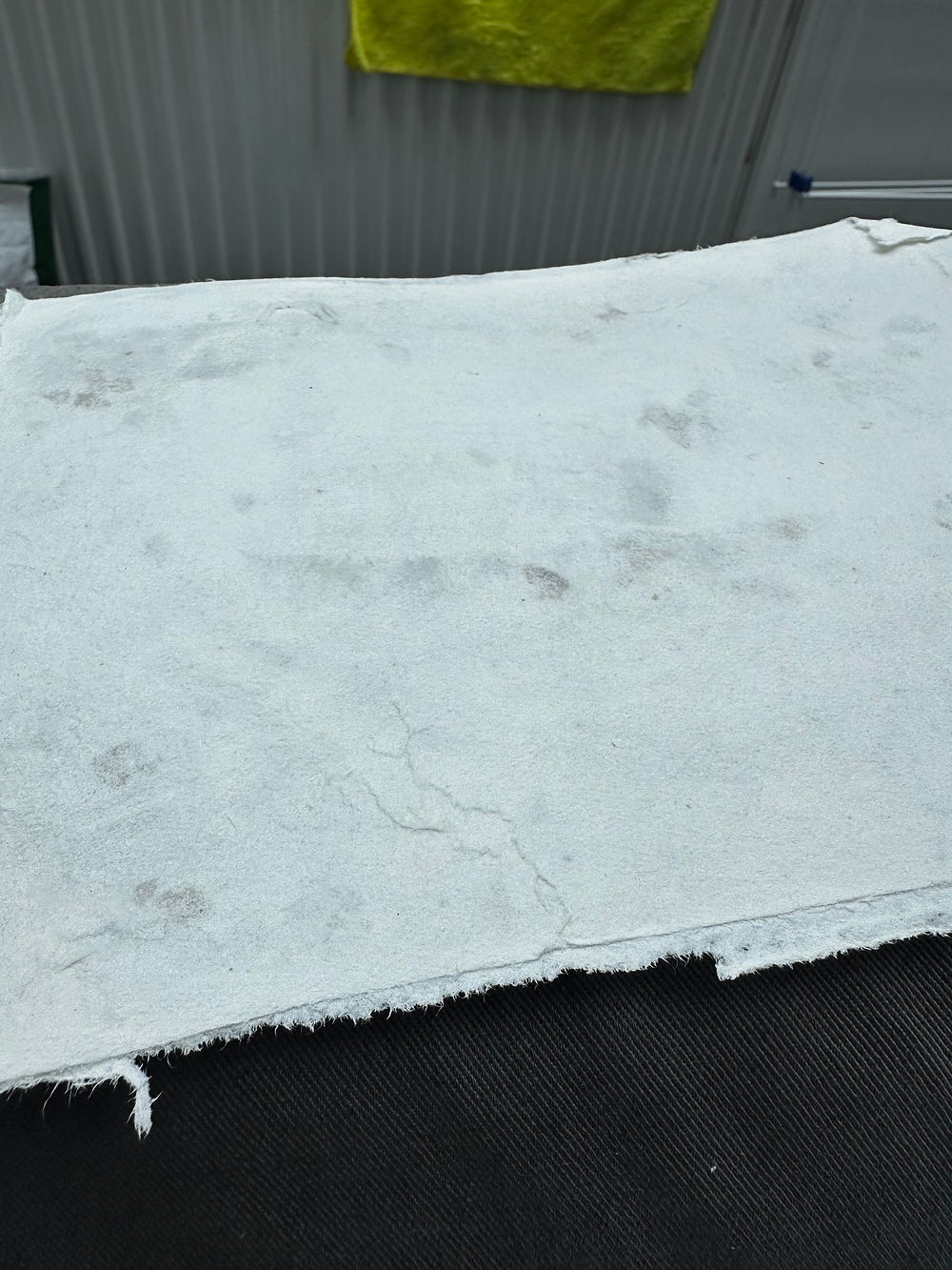
Although collecting the materials for this experiment was one of the most demanding parts of the project, the actual papermaking process itself was surprisingly simple. Over the course of a month, I collected flakes of skin in a sandwich bag, once doing so I then soaked scraps of paper in water overnight. Once softened, the paper was blended into a pulp and mixed into water ready for forming sheets. I considered blending the skin directly into the paper mixture, but because there was not a large quantity of it, I decided instead to sprinkle it directly onto the surface after straining the pulp through the deckle. I then transferred the sheets onto the torn cotton fabric from the bedsheet and allowed the paper to dry naturally over two days.
One of the main issues I encountered was that not all of the skin remained securely attached once the paper dried, making the sheets extremely delicate and fragile. I experimented with using both PVA glue and Mod Podge to try sealing the skin to the paper more permanently, but instead the adhesives often caused further ripping and damage. However, even these mistakes became useful within the project. In one instance, after accidentally tearing part of a sheet while gluing it, I layered additional paper over the damaged area, which created an interesting raised texture beneath the surface. As a result, I was able to use both the layered and exposed versions of the handmade paper throughout the book, allowing the imperfections and fragility of the material to become part of the visual language of the project itself.


Behind The Scenes of making the books content
In creating content for the book, I printed the strongest photographs from all three photoshoots, incorporated pages from the zines, created new pages containing facts about psoriasis, and included a range of artworks developed throughout the project. This process of layering making, reflection, and research became extremely rewarding and helped shape the overall identity of the book. Bringing together photography, text, texture, and handmade elements allowed the book to feel deeply personal while also communicating the wider themes surrounding psoriasis and visibility.
Working on the book over several weeks also gave each piece of work a sense of individuality and space within the final outcome. Rather than everything being produced at once, the slower pace of development allowed ideas to evolve naturally and gave me time to reflect on how different pages and materials interacted with one another. This helped the book feel more thoughtful and organic, with each page contributing something unique to the narrative and visual experience.
Following advice from my supervisor, I also had to consciously avoid making the book feel overly perfect or too uniform. Initially, I was focused on precision and consistency, but throughout the process I realised that the mistakes, irregularities, and signs of human touch actually strengthened the work. Imperfections such as uneven stitching, damaged paper, misprints, and layering errors added honesty and vulnerability to the book, making it feel more human and emotionally authentic. Embracing these imperfections became an important part of the project, reflecting both the unpredictability of handmade processes and the imperfect reality of living with psoriasis itself.


Bookbinding
The process felt simple because I had researched thoroughly beforehand, which helped me avoid common mistakes, such as using unwaxed thread that can knot when pulled through paper. Alongside reading Making Books, I also watched videos in the lead-up to bookbinding because I wanted to feel confident with the techniques and fully understand the process. This preparation meant I could recognise mistakes as I worked and problem-solve more easily.
I quickly discovered that using a curved needle was much easier, even though many of the tutorials I had watched used straight needles instead. This made the sewing process feel more natural and manageable.
Although the binding turned out slightly messy, I really love the final outcome. The intertwined threads and relatively even lines make it convincingly feel like a real book, and for my first attempt I was really chuffed with how it came together. I especially like how the thread spills out from the binding, as it gives the book a sense of looseness and movement. I intentionally chose this looping technique around the sewn signatures because I wanted the pages to move more freely and avoid becoming damaged through being attached too tightly. This decision worked really well and created the effect I had hoped for.
Following feedback from my supervision, I was challenged not to include any written instructions explaining how I wanted the audience to interact with the book. Instead, I wanted the sensory qualities of the piece to naturally encourage touch and interaction. To test this, I gave the book to my housemates. At first, they seemed hesitant, as though they were not supposed to touch it, but very quickly they began exploring the pages and textures instinctively. They explained that the book felt so tactile and inviting that they could not resist the curiosity of discovering how the different surfaces felt.
One aspect that did not work as well was measuring the signatures. Initially, I punched holes into each page separately, which meant the holes did not align perfectly. As measuring consistently became difficult, I decided to make a reference page with pre-punched holes to use as a stencil. This improved the accuracy significantly and made the process much more efficient.


Presentation Planning
Inspired by Hassan Hajjaj’s piece Jamma Fna Angels, which I saw at V&A East Storehouse’s Why We Make exhibition, I decided to design my own frame inspired by the idea of display and repetition, to represent the repition of layering treatment. I wanted the frame to hold bottles of my psoriasis treatment in a way that resembled an apothecary shelf, turning everyday medical objects into something more visual and intentional.
I carefully measured my ointment bottles and created a model with accurate dimensions to give to Francis. We then had a meeting to discuss the construction of the frame, which would be made from MDF. We decided that it did not need a backboard, as it would already be hung on a wall and adding one would create an unnecessary expense.
Once I knew the frame was possible to make, I began experimenting with different presentation ideas. I decided that black and red created the most visually impactful combination, as the contrast felt bold and dramatic.
I also felt it was important to incorporate string into the presentation because it has become such a significant visual theme throughout this project. This led to the idea of a bottle of moisturiser pumping out red string that trails into my book, which felt narratively strong and visually connected. The moisturiser is one of the products I use most frequently for my skin, so it acts as an immediate visual reference to skin conditions and personal care.