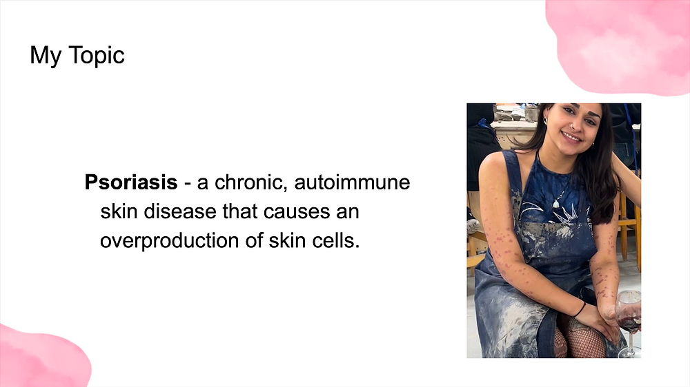
PSORIASIS:
An intergenerational perspective
PROJECT PROGRESSION
INITIAL IDEA
My initial idea was to explore psoriasis from an intergenerational perspective. I was diagnosed with psoriasis years after my grandmother, who had lived with the condition her entire life, had passed away. As I began navigating my own diagnosis, I found myself gaining a new understanding of her experiences and the coping mechanisms she had developed in adapting to life with psoriasis. This led me to question whether family members raised in similar environments might develop comparable perceptions of themselves and similar ways of coping with the condition, connecting to the wider debate of nature versus nurture.
I also wanted to explore how psoriasis has shaped coping behaviours and self image across different generations of women, identifying both the similarities and differences in our experiences.


GROUP SUPERVISION
This group supervision gave us the opportunity to present our initial ideas and refine our research questions through peer and tutor feedback. Feedback suggested that exploring psoriasis through an intergenerational perspective was both powerful and appropriate due to the genetic nature of the condition. One suggestion from peers was to explore concealment as a coping mechanism, particularly through the use of clothing.
I also received valuable feedback from my supervisor, Mim, who explained that layering was not simply part of my methodology, but that the methodology itself was layering. This was especially helpful because I had been struggling to clearly define my methodological approach. The feedback helped me better understand the purpose and structure of my project, giving me a clearer direction moving forward.


GALLERY VISIT - The Wellcome Collection
CRIT 1
The feedback I received was extremely positive, with many people describing the work as rich in insight and raw perspective. Lecturer Sarah commented that the zines were successful in transforming something traumatic into something beautiful, which was especially meaningful feedback considering the personal nature of the project.
One particularly impactful moment came from a course mate who also has psoriasis. She pulled me aside after the critique to tell me that the zines had really moved her and that she strongly related to the experiences represented within them. She explained that she also conceals her symptoms, so the work deeply resonated with her own experiences. That interaction became a real testament to the kind of impact I hoped the project would have, as creating connection and recognition for others living with psoriasis was one of my main intentions from the beginning.
I also received feedback from Sarah encouraging me to explore beauty media such as Vogue and photograph myself in a similar visual style in order to critique how beauty standards and media imagery have influenced my self image. She also advised me not to focus too heavily on redefining the word “beautiful,” as beauty is ultimately subjective.
This critique gave me a huge amount of confidence in both the project and my creative process. It reinforced how much dedication and vulnerability within the work could lead to meaningful reactions from others. The most rewarding part was being able to have genuine conversations with people who felt emotionally moved or personally connected to the work, because creating that sense of resonance and understanding was exactly what I wanted this project to achieve.


REPORT PLANNING
Following a group tutorial focused on referencing and essay planning, I realised that my method of collecting and organising readings was not as clear or structured as it could be, especially in comparison to my peers. Originally, I had been storing references within Google Slides alongside lecture notes and development work, which made it difficult to quickly locate or recall important sources.
As a result, I changed my approach and began organising my references visually using Miro. Alongside this, I also created a bibliography document in Microsoft Word that I continuously referred back to and updated throughout the project. This immediately transformed my organisation process because I was able to visually map connections between ideas, arguments, and references more clearly. Unlike before, where sources often felt “out of sight, out of mind,” the Miro board allowed me to easily revisit and recall readings while also identifying gaps within my research. For example, I could clearly see where certain arguments or themes lacked supporting references, helping me plan my research and essay structure more effectively.


EXHIBITION VISIT - GREENWICH
I viewed Monsters of Radical Empathy: Radical Empathy and Emotional Outpourings, a collaboration co-led by Rahesh Ram and Marina Otero Verzier. Exhibited at the Stephen Lawrence Gallery at the University of Greenwich, the collection explored diverse voices and the idea of “the inner monster that everyone has in them.” The exhibition encouraged participants to adopt an Italian-inspired approach of “airing out your laundry,” influenced by the literal laundry habits observed during the project’s research and development.
I found this approach particularly inspiring because it strongly connected with the themes of vulnerability and exposure within my own project. The idea of openly revealing personal experiences and emotions influenced both the title and the journal-like tone of my magazine. I really enjoyed working in this honest and confessional way, as it allowed the work to feel authentic and transparent, which many people later described as powerful and emotionally moving.


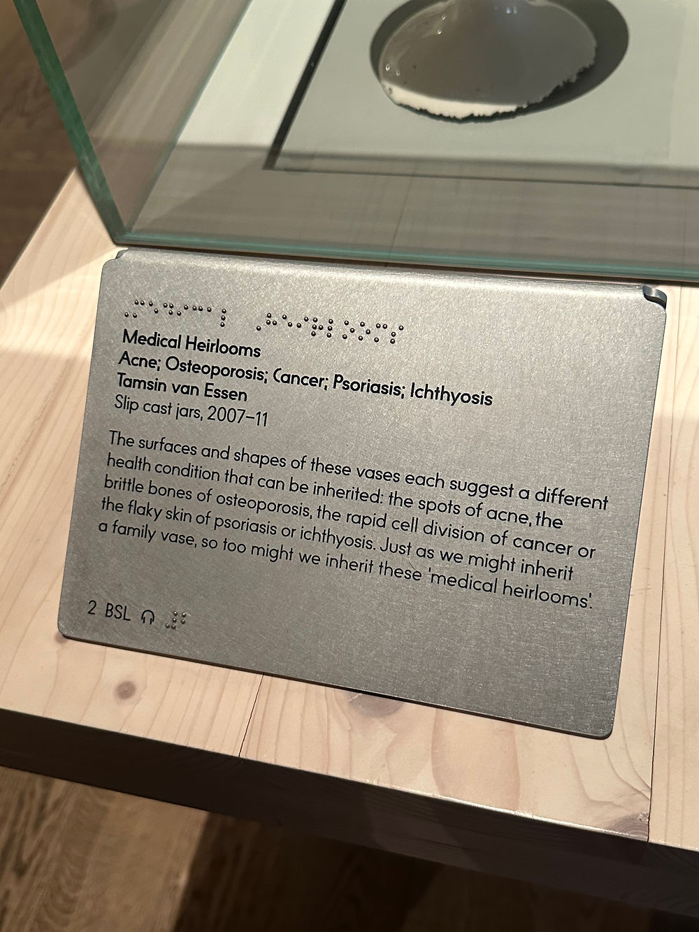
In order to understand what creative outputs already existed surrounding psoriasis, I visited the Wellcome Collection, which featured a range of archival materials related to skin conditions, chronic illness, and medical history. This visit was particularly insightful because it helped me recognise that psoriasis is most commonly represented through a medical or clinical lens. Even within conversations surrounding skin positivity and empowerment, psoriasis is often grouped together with eczema despite them being entirely different conditions and experiences.
One piece that stood out to me was Medical Heirlooms by Tamsin van Essen, which demonstrated how unconventional and conceptual approaches can be used to represent medical conditions in a more personal and thought provoking way. This inspired me to think more creatively about how I could present my own work and encouraged me to move beyond purely documentary or medical representations of psoriasis.
SUPERVISION
A tutorial with my supervisor allowed me to discuss my current progress and next steps. I made note of several useful suggestions that my supervisor provided, the most significant being the recommendation to research Objectification Theory, which has been extremely helpful for the theoretical component of my project.


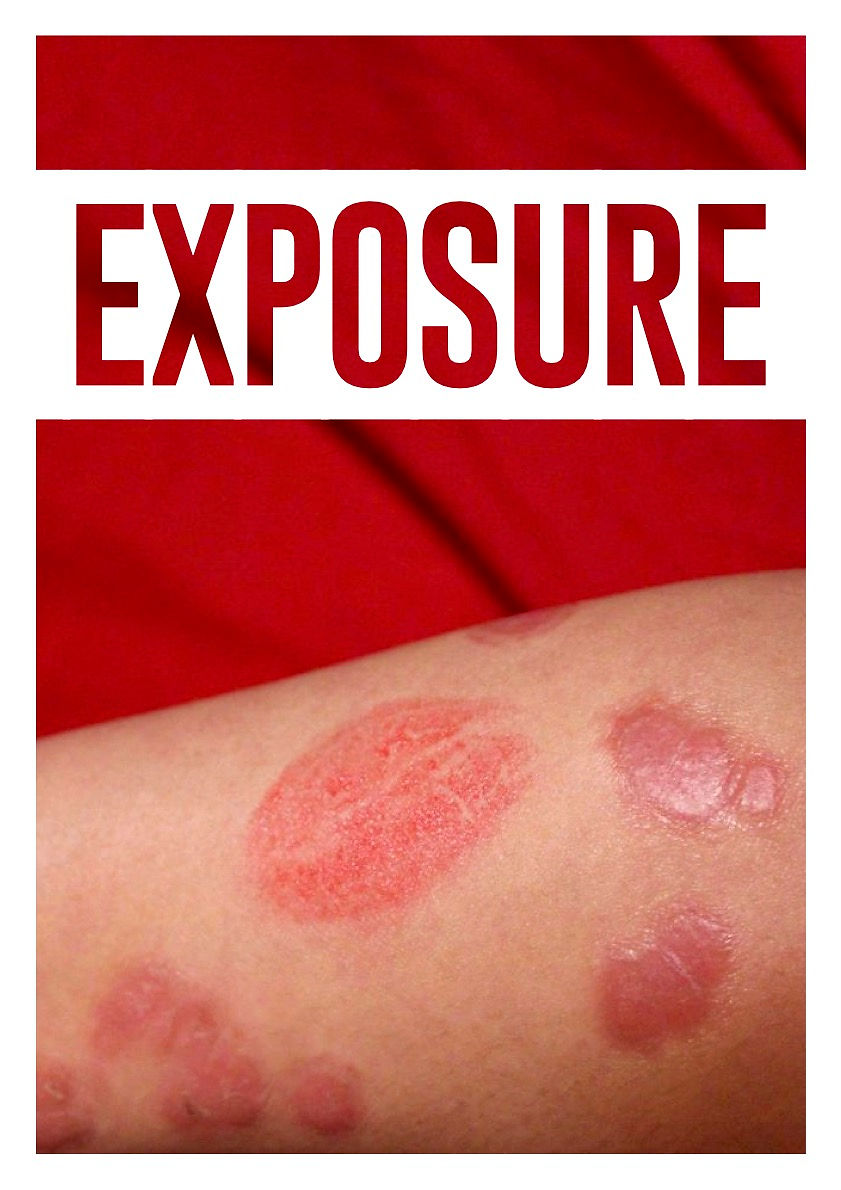


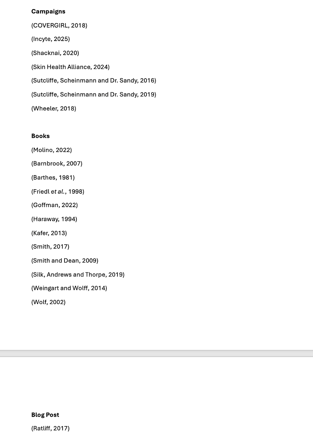
EXPOSURE MAGAZINE
I loved these outcomes because they felt visually powerful and emotionally engaging. The imagery and compositions were successful in communicating the intensity and vulnerability I wanted the work to convey. However, I felt that the typography and copy let the work down slightly. The choice of fonts and layout lacked consistency, which weakened the overall impact of the designs.
Because the publication relied on having a strong and uniform visual identity, the inconsistencies became much more noticeable. This made me realise how important typography and layout are in creating cohesion across a series of pages, especially within editorial style work. Although the imagery itself was successful, this stage highlighted the importance of refining the graphic design elements so the visual language could feel more intentional and unified.


CRIT 2 pt.1
Attending the first session of critiques was extremely insightful because it allowed me to learn from others about different and interesting ways to present work. Although there was not a huge amount I could directly apply from other projects to my own, I gained a much stronger understanding of how I should use critiques more constructively. As a result, I began thinking more carefully about the kinds of questions I wanted my peers to answer and what specific feedback would be most useful for developing my project further.
We also had the privilege of speaking with Rahesh Ram, who gave an in depth discussion about the collaborative project Monsters of Radical Empathy: Radical Empathy and Emotional Outpourings, which I had already visited the week before. The project was incredibly inspiring, particularly the idea that everyone has an “inner monster” representing the parts of themselves they fear showing to the world. Hearing this made me realise that my own “monster” was my skin and my experience of psoriasis.
One piece that particularly resonated with me was a mask covered in eyes, whom Rahesh says was created by a woman who wore a hijab and explained that the eyes represented the feeling of constantly being stared at in public. I connected strongly with this because, during my first attempt at creating a zine about my psoriasis journey, I had also created imagery covered in eyes to represent feelings of visibility, judgement, and discomfort in public spaces. Because of this discussion, I decided to incorporate my artwork featuring eyes on the train into my final piece, as I realised the theme of feeling watched or judged could resonate with people even if they do not personally experience psoriasis.
CRIT 2 pt.2
In the second session of crits, I presented my work to the group. Although my method of presentation was quite simple and restrained, this was intentional because I was worried that an overly experimental presentation might distract from the work itself. However, through the feedback and experience of the critique, I realised that presentation can actually enhance and add value to the work rather than take away from it. This made me want to become much more experimental and confident with presentation methods moving forward.
The feedback I received was extremely helpful, with one of the main points being the importance of red within the project. It became clear that red was the strongest and most meaningful visual element throughout the work, carrying symbolism connected to blood, inflamed skin, pain, visibility, and ultimately empowerment. Because of this, red became the dominant colour I continued to pursue throughout the project.
I also received feedback encouraging me to move towards the format of an artist’s book, which immediately felt like the right direction. Throughout the project, I had naturally progressed from creating zines, to magazine style layouts, and eventually towards bookmaking, gradually building my confidence with print based formats. The idea of creating an artist’s book was especially exciting because it allowed for a much more experimental and abstract approach. In comparison, magazines and zines had begun to feel more structured, uniform, and creatively limiting, whereas the artist’s book format gave me the freedom to explore texture, layering, materiality, and storytelling in a much more personal and expressive way.


EXPLORING NEXT STEPS
At the beginning of the project, I was unsure what the final outcome of the book would look like and struggled to know where to start. However, after speaking with Francis, I realised how open the possibilities of the project really were. That conversation helped me feel less restricted and more confident in experimenting with different directions and techniques.
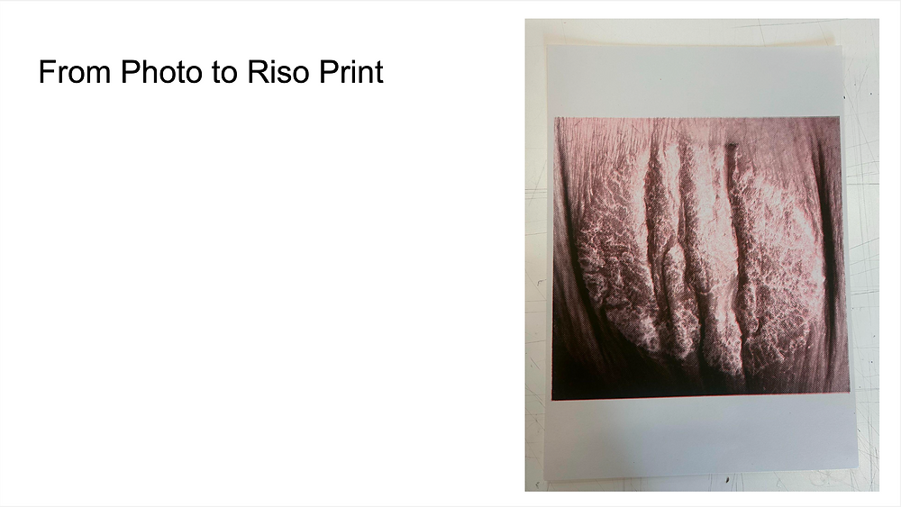
Francis suggested that I explore printmaking and paper-making because of their strong relationship with layering, which was becoming central to my methodology and visual approach. He also introduced me to risograph printing, which sparked my interest in using print based processes within the project. Although I later decided that risograph printing was not the right fit for the final outcome, that initial suggestion opened up a much wider exploration into printing techniques and ultimately led me towards processes such as lino cutting and making paper out of my skin.


PHOTOGRAPHING MY SKIN pt.3
Photographing myself using a more landscape focused approach both worked and did not work. On one hand, the images felt fragile, intimate, and visually captivating. They captured the physical texture and vulnerability of psoriasis in a softer and more observational way. However, because my face was not visible within the photographs, the images communicated more representation than confidence or confrontation. In comparison to the previous photoshoots, which contained much more visceral emotion and personal intensity, these outcomes felt quieter and more detached emotionally.
Despite this, I still found the photographs very successful because they presented an extremely uncomfortable stage of a psoriasis flare up in a way that appeared visually compelling and almost beautiful. At its worst and most physically uncomfortable, the skin still carried texture, colour, and detail that translated powerfully through photography. I found this contrast between discomfort and beauty particularly interesting within the context of the project.
Although the images lacked some of the emotional intensity of earlier shoots, I still want to use them within the book and exhibition because I feel they capture psoriasis in a very complete and honest way. The photographs document the condition clearly while still allowing the work to remain visually engaging, and I think they could work especially well as exhibition imagery alongside the art book.
RISOPRINTING
I was disappointed with how the risograph printing turned out on paper because it felt too impersonal and lacked the same sense of confidence, vulnerability, and empowerment that my other work communicated. Although I was intrigued by the textures created through the printing process, the outcomes did not feel emotionally connected to the themes of the project in the way I had hoped.
As a result, I decided to move away from risograph printing and instead explore lino cutting. Lino printing felt much more manual and hands on, allowing me to physically carve and layer imagery in a way that connected more naturally to my methodology and making process. In comparison, risograph printing relied heavily on digital preparation, which made the outcomes feel more detached and clinical. Choosing lino cutting instead allowed the work to retain a stronger sense of human touch and personal involvement, which was much more in keeping with the tone of the project.
USING RED THREAD


Red thread became a significant visual and conceptual decision within the project, inspired both by artists and by its symbolic associations. The Japanese red string theory suggests that people’s lives are connected by an invisible string of fate, and artists such as Yoshifuji Katsu and Chiharu Shiota use red thread to represent connection, memory, and bloodlines. This symbolism strongly resonated with my own project, particularly because psoriasis is an inherited condition connected through family and genetics.
The use of red thread also felt visually and emotionally appropriate in relation to my personal experiences of psoriasis. It referenced the red threading on bedsheets I bought to conceal blood stains, the bleeding caused when my skin cracks, and the inflamed redness of psoriasis flare ups themselves. The thread therefore became more than just a material within the book, instead acting as a symbol of pain, concealment, inheritance, vulnerability, and empowerment all at once.


CRIT 3 - NEXT STEPS
Following my critique, where I presented my proposed next steps, I received feedback encouraging me to continue exploring experimental techniques and processes. I also received very positive reassurance regarding my unconventional ways of representing skin confidence and psoriasis. It was encouraging to see that the audience responded openly to the vulnerability within the work, rather than reacting with discomfort, which gave me more confidence in the direction of the project.
Following these discussions, I began refining the colours, content, and copy within the work, thinking more carefully about how each element contributed to the emotional tone and visual identity of the final book.


CREATING THE BOOK
This was a beautiful outcome to create at the end of an incredibly meaningful project. The idea of layering all of my research, reflections, findings, and creations together felt like such a complete and fitting way to conclude the project.
I have learnt a lot from the process of bookmaking, especially the importance of trusting the process. At times, everything felt chaotic and overwhelming, and the only way I could maintain control was through planning, experimenting, and finding ways to transform mistakes into successes. I realised that I needed to allow the work to exist in its own form, without being overly concerned with neatness or perfection, as this would have taken away from its meaning.
This was advice from Mim, my supervisor, who explained that the work did not need to be completely uniform because it had not all come from the same place. In fact, the lack of uniformity is what brings a richer sense of meaning and authenticity to the book.